Planning a New Website: Your Checklist
Everyone has their own process for getting organised, you might have a word doc with it all written out and loads of links or a Pinterest board of ideas. However you work, here are some things you need to consider when you're planning a new website.

Where Do I Begin?
The best place to start when it comes to planning your website is what do you want your website to do? Are you more interested in generating leads or just getting your information out there? Do you want to sell products online or do you provide a service which can be booked online?
Every business is different. If you're a bit lost as to what to prioritise then check some competitors' websites, a bit of snooping might help you define the primary purpose of your site. Most businesses want their site to perform multiple functions, but you should identify which is the key action that you want people to take so that your site can be designed with that in mind.
Functionality
So you know what you want your website visitors to do, for example, purchase your products online. It's clear in that brief that you'll want to have an e-commerce website so that they can complete that action, but you'll probably also want to have a blog so that you can promote specific products and the business in general whilst reaping the SEO benefits of updating your website regularly. You may take your products to markets and trade shows, so you might want to utilise an events function so everyone will know where you are and when.
If you're selling products online you should also use a CRM (customer relationship management) tool so you can keep all the details of previous sales together. It's getting quite complex, but it's important to work out everything that you want your site to do before you start building it. Adding on big functions at a later date tends to either be messy or costly.
At Sonder, we have a huge range of functionality built into our CMS (content management system... a fancy word for an admin area) and we can turn on and off the modules depending on what you need. We're also a friendly bunch who've seen every type of website going, so we can advise you on what is and isn't important for your business based on your size and your primary goal. The final decision is always up to you, but it never hurts to get an expert opinion.
Website Design
Now you know what you want your website to do and you've got an idea of the different functionality you need, it's time to think about what the website will look like. There's loads to think about so here are some key points to consider:
Branding
If you already have a company logo, colours and fonts that you're thrilled with then skip this part. But maybe you're new on the scene and need the full works or you just don't feel your logo reflects your business anymore. If that's you then let's talk branding.
Most companies have an idea for their logo, it usually includes the brand name and another element - usually a representation of your brand ideals, customers or product itself. For example, an eco brand would often use a leaf and a car-related product may use a tyre.
Colours are more important than you think, this infographic shows how different colours are perceived by your customers. You're looking for at least three colours to create a brand palette, but five gives you strong array to use. We've got a whole blog on choosing colours for your website.
The fonts you use on your website also give people an impression of your business. We urge you all to steer clear of Comic Sans! You need a heading font, a pretty plain body font and usually a third option for emphasis. They need to work together to give the right feel for your business brand. Try out some of your content on this website to see it in all the basic font styles, if you need more help we've got a blog on website fonts too.
This may all sound complex, but fear not! That's what we are here for. Use the above to get your ideas in order, if you have any. Whatever ideas you come up with you just need to hand them over to us and we'll come up with some options that you can pick elements from, we can refine the idea and work with you to get to the logo, colours and fonts that are perfect for your business. If you want a quote for branding just get in touch.

Navigation
The best way to decide on the navigation style for your website is to see how other websites are doing it and pick some that you like. Keep in mind you'll need examples of sites which have similar amounts of links to you.
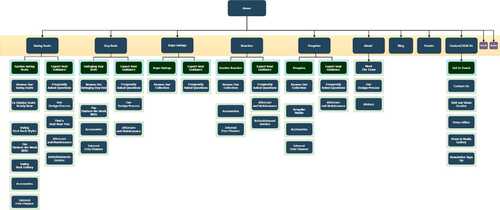
It's a good time to consider your sitemap of pages, draw out your homepage at the top, all the pages in your top navigation below in a line and their drop-down menus (if applicable) written underneath each of those in a list. This can be quite a complex process for larger sites and we're happy to help iron out your ideas.
Layout
It doesn't sound that exciting, but the way your website is laid out can make a big difference to the look. Some sites have quite dense text, particularly legal sites with complicated language, that sort of site benefits from a lot of white space to give the reader room to digest the content. A more art-orientated site can benefit from colour and integrated design elements like imagery with short paragraphs of overlaid text rather than plain text blocks and white space.
Think of some descriptors that you want your layouts to achieve, here's some examples:
- modern
- posh
- contemporary
- busy
- peaceful
- bright
- eyecatching
- spacious
- luxury
- relatable
- compact
- professional
- simple
- detailed
- engaging
Photography
The imagery that you use on your website can make or break the aesthetic and feel of the site. It's often the last thing that people think about but it's quite key to making the site look like your own.
Stock photography can be really helpful in padding out your site with high-quality images but it should not be the only imagery you use. Most people can sense a stock image these days, if your site is full of them it doesn't add credibility to your authenticity as a business. Google can also detect stock images and much prefers real photos taken just for you.
Hiring a photographer can seem like a huge expense, but they will give you hundreds of usable imagery from one shoot and you'll have fodder for your website, social channels and real images of any of your products that are worth their weight in gold - and we say that as a company that does not offer photography as a service (it's one of the few marketing services we haven't delved in to!).
If you want to take your own photos you need to think about lighting, composition and feeling to make sure you're getting the right look for your site. We recommend ensuring there are some people in your images, as this helps people engage with your website more. Here's a quick video on some top tips.
CTA
We've talked about Call To Actions before, you need to direct people to the action that you want them to take. It's something to keep in mind while you've got the primary purpose and any secondary purposes in mind, what CTAs do you want to promote and where?
This is something we'll mostly choose for you based on our extensive experience building websites, but it may help you when thinking about the layout of pages and the navigation around the site, where do you want your customers to go on their journey?

There're too many decisions!
Yes, to be honest, there are. But you don't need to make them all. We just need some direction from you on some of these things and we have the expertise to fill in the blanks and create the right website for your business.
It's important to remember that hopefully, you will like your website, but it's not for you. You need to think of what your customers want, what they will find easy to use and what will help them to complete the primary action for the site.
We find many business owners want a website they can be proud of, that suits their taste, but if that website doesn't engage their target audience they'll be very disappointed.
So we advise you to consider your customers and their needs from the outset. By all means, add your own creative flair, but don't be driven by your own preferences over that of the customers.
Building Your Website
If all of the above is too much to handle don't panic, we're here to help. We can take as much or as little guidance from you about your site and come up with something that works. No one knows your customers like you do, so it's in your interest to give us as much direction as you can about what will work best for the people you're trying to engage with.
If you're struggling with sorting out your ideas for your website then get in touch. We've got over 40 years of experience building websites between us so we've seen it all. We can have a meeting or a video call with you and anyone at your end who might have some ideas to contribute, and we can brainstorm any areas you're not clear on or need guidance with.
While you're there ask us about our SEO packages - getting your website found in search engines is the next step once you've built your perfect site.
Other Relevant Resources
There's always more to learn, we recommend these blogs:
Posted on June 22nd 2020


