Website Refresh For Wireless Phone Chargers
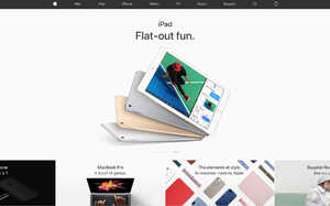
It seems like just a few years ago the internet was adorned with fixed width pages, block colours and far too much text, even the occasional colourful GIF! The internet is moving fast, and websites are becoming sleeker, more visual and graphic than ever before. Can anyone remember what the Apple website looked like 20 years ago?! Let us remind you.


As you can see, a lot has changed. Once a colourful mess, now a sleek, uniform and simple design. Featuring fully responsive goodness, sleek animations and much more. Pretty fitting for Apple, if you ask us!
Wireless Phone Chargers, a long-standing client of Sonder Digital, were fully aware of this and recognised the need to update their site. A popular e-commerce store based on emerging technology, the site needed a facelift and a revamp on the overall user experience.
We came up with a new e-commerce theme that matched the clients needs perfectly. With a clean, largely white interface paired with full-screen content blocks, the navigation has been vastly simplified to allow customers to reach the products quicker and with less confusion.
The website is fully responsive and conforms perfectly on any sized screen, including mobile and tablet which is now a key requisite for Google's impending mobile-first index, helping future proof the site.
Why not head on over and take a look around? We'd love to know your thoughts. If you think your website is in need of an update or re-design, don't hesitate to get in touch with us to see what we can do.
Other Relevant Resources
There's always more to learn, we recommend these blogs:
Posted by Rob Fellingham on March 28th 2017


